Monday, 27 February 2012

Music Magazine: Front Cover - drafts and final.

First Draft


This is the first draft of my front cover. I have inserted the photo, title and barcode. The next stage for my front cover is adding cover lines and puffs ect. I edited the photo to make it suit the genre of my magazine more - pop. I used picnik.com to edit and adapt my photo. I used the boost tool, to make the photo more exiting. I also used the tint reverse effect - to change the color of her eyes to blue, to make more of a contrast with her red lipstick. I also created by barcode, by copying and pasting a barcode of google images, and then using a text box filled white, I wrote the date and price for my magazine. I also added my masthead, trying two colors overlapping each other, to see what effect it gave. I like the effect.

Second Draft


This is my second draft for my magazine. I tried just one color for my masthead, and have decided I will go back to the original two colored masthead. I also added my cover lines around the edge of the page. I think they look quite scatty, and messy, therefore I will either keep them on the left side third, or just keep a few so the page looks less busy. I also added a pug, but I feel the position and color of it takes the attention off the picture. I will move it lower down the page so the focus is still on her face. I also added the headline about my artist Megan Seward. I like the position, but I am going to edit the color and arrangement of it. 
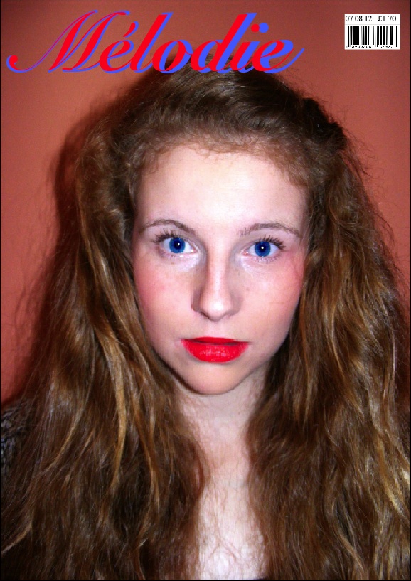

THIRD DRAFT. 


This was my first final draft of my front cover. But when I got people's opinions, they said I should rearrange some of the cover lines and text on it. So i deleted some of the text that was at the bottom of the page and made it stand out more. I did also completely change the cover lines as the text was not standing out and the color wasn't showing up. It also looked very boring and unprofessional. I also got told that the text in the puff is not big enough, so I changed that too. 


FINAL FRONT COVER. 


This is my final front cover, I deleted some of the text and made the cover lines all different font and sizes, to make it look more professional. I also moved the bar code, as after looking at several magazines, the bar code is usually in the bottom right corner. I then centered the title, making the image and whole layout look more spacious. I also edited my puff and make the writing bigger and easier to read. I am pleased with how my front cover turned out, and think it looks very realistic :) 

Thursday, 2 February 2012

Music Magazine; Annotated Double Page spread.

What is a double page spread?
It is two facing pages containing appropriate material which is intended to be viewed together ( so there should be a consistent design statement) It is often abbreviated to DPS. It could also be referred to as a 'feature spread'.

There are many different types of double page spreads or feature spreads. These are examples of a few of them:
  • A poster styled double page spread. The key features of this style would be who the poster is of or something relating to the story.A poster normally covers one page of a double page spread or the whole double page spread. Could be very suitable for my music magazine if the photograph was of a relevant indie artist or band.
  • An interview where an individual or group are questioned and responses could be written up in a question and answer format or as a continuous prose. Could be highly suitable if interview subject is from a band who are popular with my target audience.
  • An album review with a star rating, a picture of the album and comments about the album. Could be written up as bullet points or separate paragraphs. You could have a spread on one band on their many albums or perhaps a variety of album reviews from different indie artists or bands. This type of double page spread would go well with my magazine genre - indie. But if I chose this type of double page spread I think I would use a variety of different work by indie artists.
  • You could use the same idea as the album review but this time concentrate on one album with a song-by-song review. Each song could be sectioned off from each other, you could include comments people have made about the chosen song. You could also include the lyrics for the song. This would work well if you also had written why the chosen indie band/artist wrote this song and what the deeper meaning of the song is. Where they got influence from etc possibly also done in a question and answer style format.
  •  A Photo shoot type double page spread. Where a band/group or artist have many photos of them spread across two pages. I don't think it would be very suitable for my music magazine double page spread because I think it needs text included, especially because of the pull quote "She ruined my life" written on my front cover. I think there needs to be reference to this visable.
  • A gig/festival double page spread. This is a feature page that advertises the different concerts by different bands that are on. These include the bands name, dates, places, where to get tickets from and band websites and their information.

Annotated Double Page Spread