Monday, 27 February 2012

Music Magazine: Front Cover - drafts and final.

First Draft


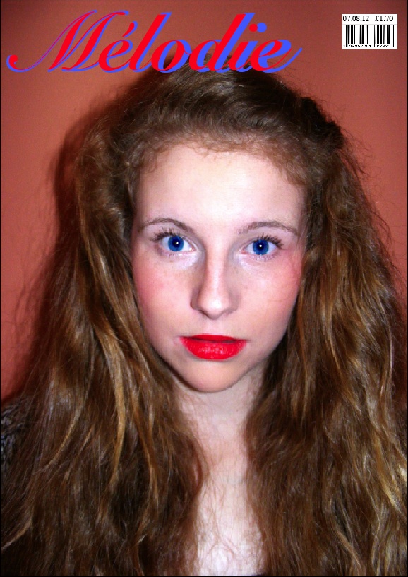
This is the first draft of my front cover. I have inserted the photo, title and barcode. The next stage for my front cover is adding cover lines and puffs ect. I edited the photo to make it suit the genre of my magazine more - pop. I used picnik.com to edit and adapt my photo. I used the boost tool, to make the photo more exiting. I also used the tint reverse effect - to change the color of her eyes to blue, to make more of a contrast with her red lipstick. I also created by barcode, by copying and pasting a barcode of google images, and then using a text box filled white, I wrote the date and price for my magazine. I also added my masthead, trying two colors overlapping each other, to see what effect it gave. I like the effect.

Second Draft


This is my second draft for my magazine. I tried just one color for my masthead, and have decided I will go back to the original two colored masthead. I also added my cover lines around the edge of the page. I think they look quite scatty, and messy, therefore I will either keep them on the left side third, or just keep a few so the page looks less busy. I also added a pug, but I feel the position and color of it takes the attention off the picture. I will move it lower down the page so the focus is still on her face. I also added the headline about my artist Megan Seward. I like the position, but I am going to edit the color and arrangement of it. 


THIRD DRAFT. 


This was my first final draft of my front cover. But when I got people's opinions, they said I should rearrange some of the cover lines and text on it. So i deleted some of the text that was at the bottom of the page and made it stand out more. I did also completely change the cover lines as the text was not standing out and the color wasn't showing up. It also looked very boring and unprofessional. I also got told that the text in the puff is not big enough, so I changed that too. 


FINAL FRONT COVER. 


This is my final front cover, I deleted some of the text and made the cover lines all different font and sizes, to make it look more professional. I also moved the bar code, as after looking at several magazines, the bar code is usually in the bottom right corner. I then centered the title, making the image and whole layout look more spacious. I also edited my puff and make the writing bigger and easier to read. I am pleased with how my front cover turned out, and think it looks very realistic :) 

Thursday, 2 February 2012

Music Magazine; Annotated Double Page spread.

What is a double page spread?
It is two facing pages containing appropriate material which is intended to be viewed together ( so there should be a consistent design statement) It is often abbreviated to DPS. It could also be referred to as a 'feature spread'.

There are many different types of double page spreads or feature spreads. These are examples of a few of them:
  • A poster styled double page spread. The key features of this style would be who the poster is of or something relating to the story.A poster normally covers one page of a double page spread or the whole double page spread. Could be very suitable for my music magazine if the photograph was of a relevant indie artist or band.
  • An interview where an individual or group are questioned and responses could be written up in a question and answer format or as a continuous prose. Could be highly suitable if interview subject is from a band who are popular with my target audience.
  • An album review with a star rating, a picture of the album and comments about the album. Could be written up as bullet points or separate paragraphs. You could have a spread on one band on their many albums or perhaps a variety of album reviews from different indie artists or bands. This type of double page spread would go well with my magazine genre - indie. But if I chose this type of double page spread I think I would use a variety of different work by indie artists.
  • You could use the same idea as the album review but this time concentrate on one album with a song-by-song review. Each song could be sectioned off from each other, you could include comments people have made about the chosen song. You could also include the lyrics for the song. This would work well if you also had written why the chosen indie band/artist wrote this song and what the deeper meaning of the song is. Where they got influence from etc possibly also done in a question and answer style format.
  •  A Photo shoot type double page spread. Where a band/group or artist have many photos of them spread across two pages. I don't think it would be very suitable for my music magazine double page spread because I think it needs text included, especially because of the pull quote "She ruined my life" written on my front cover. I think there needs to be reference to this visable.
  • A gig/festival double page spread. This is a feature page that advertises the different concerts by different bands that are on. These include the bands name, dates, places, where to get tickets from and band websites and their information.

Annotated Double Page Spread


Monday, 30 January 2012

Student Magazine: Edited and chosen photo's.


Front Cover Chosen Photo- 


I have chosen this photo as I think the image is quite striking, and the blue eyes contrast well with the red lips. 


Contents page chosen photo -


I have chosen this photo as it is a different girl used to my front cover and double page spread and because the black and white image along with the pose is quite edgy.


Double Page Spread chosen photo - 


I have chosen this as the eye contact is strong and the image is striking yet simple. 

Monday, 16 January 2012

Music Magazine: Photography.

Click here to view my Photography on Flickr.

Music Magazine: Photography inspiration.


I researched Pop Artists, and got some idea's for my photoshoot. I used, Jessie J, Beyonce, Adele, Frankie from the Saturdays, Florence and the machine, and Jade Thirwlall from Little Mix. 


Music Magazine: Flatplans

I have created a flat plan for both my front cover and my contents, to help me when I make them. 


I have also created a Flatplan for my double page spread, to guide me when I make it. 


Monday, 9 January 2012

Music Magazine; Proposals.

FRONT COVER. 


Who are you aiming your magazine at specifically? 
My magazine will be targeted students, both male and female. The age will range from 16-24. I want to keep the cover modern and featuring the newest artists, to attract the younger audience.


The genre for my magazine is Pop/Chart music. I have chosen this because I think there is a definite target audience for this style magazine. It will include feature stories from pop artists, gossip about celebrities, new chart updates and pictures of the Artists. 


What title have you chosen and why?
For my title, I wanted a straight forward word such as tune, or song, to keep it simple and obvious what the magazine was about. But instead of simply calling it 'Tune' I thought it would be more edgy if i translated it into a different language. I tried, french, spanish, and polish. The french was, mélodie, the spanish was canción, and the german was piosenkaThe title I chose was 'mélodie' This was because it still sounded like a music word, and I think would look effective on a magazine cover.


What fonts do you want to use?
I want to use a simple yet eye catching font for my front cover. I will use a different size for the title to make it stand out, and similar font but slightly smaller for my cover lines and the rest of text on the cover. 


What are your ideas for taglines?
I do not want to use a tagline for my magazine, therefore I have no ideas. I think having a tagline, and coverlines would make my cover look too busy. 


When in the year will it be published and how frequently will it be published?
My magazine will be published in Summer, so I can use a more bright range of colors on my cover. It would also increase sales, as people will be going abroad therefor will buy magazines for the plane and the beach. My magazine will be published monthly.

What kind of image do you expect to put on the front cover and how will you go about getting this image?

I want to take an eye catching medium close up of a Pop Artist, or band. On a pop magazine, you would expect to see a well known singer or band on the cover in some kind of pose. This is the type of image I want to get across. I will either choose for my front cover, a close up of a female artist, influenced by Artists like Jessie J and Lady Gaga. Or a photo shoot of a mid shot of male twins, influenced by jedward.  


How much would your magazine sell for?
£1.70, so that it is not too expensive, and people of any wealth can purchase it. 

What are the dimensions of the cover?

My magazine will be 11 by 4 inches. I chose this is this is the most popular magazine size.


What are your ideas for coverlines?
For my coverlines, I wanted them to be in the same style and content as the magazine. For example, 'Win tickets to the latest Jessie J gig', as it is in keeping with the theme. I may use something along the lines of 'A once in a life time opportunity to go backstage and meet the star!', as the reader would be engaged to this and will want to win the tickets - baring in mind the artist must be successful. 


Double Page Spread.


What type of double page spread do you intent to create?
I intend to make an interview style Double page spread, with a cover story of a new upcoming artist. One photo will take up one page.

How is this appropriate/relevant for your target audience and genre of music?
My target audience being teenagers, will want to read funny and personal questions about the artist. The genre is pop therefore the interview and photo will be using colours I feel represent the genre - in this case I have used a basic black, white and pink theme to keep it edgy.

How you intend to incorporate original images?
I will use one side of the double page spread for my photo.

How will you obtain information and images for your feature spread?
I will take photo's using my mums Fuji finepix camera, as the quality is alot better than my camera. I will take photo's of a few of my friends, keeping the backgrounds simple and the shots natural. I will make up the information based on how I think my artist would be, for example my artist is based on Adele, a layed back, natural, yet talented singer.

What visual style would you like to achieve?
A classy, not too over the top yet exiting layout. I will use black, pink and white and a range of fonts to create an edgy look. I aim to make it look aesthetically pleasing.

What style of writing do you intend to use?
I intent to write and informal stlye interview. Asking the artist questions about their life.
What will your magazine be about?