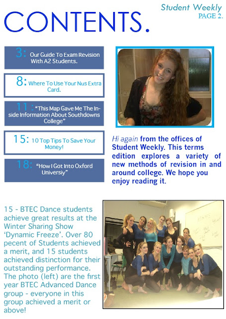
When making my contents page I chose a colour scheme of Blue. I think the colours I have used work well, especially with the bottum photo of BTEC Dance students, they are wearing blue too. I was in the Dance show, and thought it would be a good story to put on my contents page, so I took my camera along and got a group photo. It works very well. Although this was only a mock up of a contents page, I took it very seriously as it will help me when it comes to designing our music magazine. I am very happy with the way my contents page looks.
Thursday, 24 November 2011
Monday, 21 November 2011
Student Magazine Front Cover.
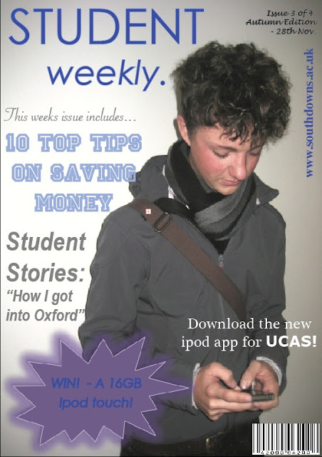
At first I wasn’t going to use this photo. I felt that because the student was on his phone it looked to casual, but once I thought of the idea of an Ipod App for UCAS, and added this text to the magazine - it looked more studious. I created the pug shape on Microsoft word and added a glow effect around it, which I thought looked good with the colour scheme I chose (blue, purple, and grey). The barcode is copied from the internet, and I feel this makes the magazine look realistic. I kept the fonts sophisticated and tried not to make them girly as I didn’t want the magazine to only to targeted at females. Overall, I am really pleased with my magazine cover, and feel more confident using in design, so that when it comes to making my Music Magazine front cover, I won’t struggle.
Monday, 7 November 2011
Learning how to use in design.
Using one of the photo's I took around college, I uploaded it to In Design CS3.
I added my chosen title and have tried a variety of different colour title's and put together my photo and my masthead. It helped me learn the basics of In design and will help me when it comes to making my Student Magazine.
I have decided to use this photo for my student magazine as the intersection points are all clear and the colour has a dark and wintery feel.
Thursday, 3 November 2011
Student Magazine Photography.
We took some photo's around college, in preperation for our Studen Magazine front cover. After what I learnt in the first part of our lesson, I had to be very precise when taking my photo's.
I had to consider;
- if there was room above the students head so the mast head would fit it
- if the arms were fully in the picture
- if a gap had been left for coverlines
- if the head is the main focus( intersection points)
My idea behind this image was that the student would look casual and not typically studying to give a more relaxed feel on the magazine. I think the lighting in this photo is good, but could be better by making it a bit brighter. I could do this on photoshop. The facial expression is very bland, and I want my image to give a happy vibe. The position of the photo is good as his eyes are on the intersection points.
My idea behind this image was that the student would be typically studying, and portraying a studious vibe for collage. The same as the previous photo, I think the lighting could be better. The facial expression in this photo is very focused on the folder, and if I decide to use a photo like this on my magazine this is the expression I want. The position of the photo is good as his eyes are on the intersection points.
My idea behind this image was that the student would look casual like my first photo, but I wanted to use a girl. Again the lighting in this photo is the same as the other two, as they have all been taken in the same place.
I have decided to use the first photo as I feel the photo is good, and the intersection points are all correct and his arms are fully in the photo. But when I come to creating my music magazine I am going to spend much more time on the photography section so that I can get the exact photo I want.
Subscribe to:
Comments (Atom)


