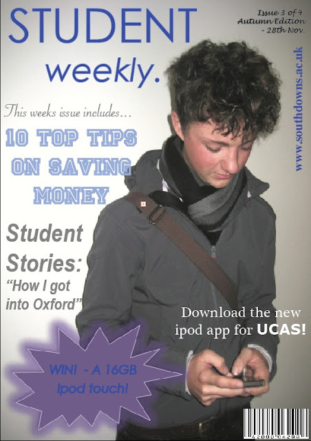
At first I wasn’t going to use this photo. I felt that because the student was on his phone it looked to casual, but once I thought of the idea of an Ipod App for UCAS, and added this text to the magazine - it looked more studious. I created the pug shape on Microsoft word and added a glow effect around it, which I thought looked good with the colour scheme I chose (blue, purple, and grey). The barcode is copied from the internet, and I feel this makes the magazine look realistic. I kept the fonts sophisticated and tried not to make them girly as I didn’t want the magazine to only to targeted at females. Overall, I am really pleased with my magazine cover, and feel more confident using in design, so that when it comes to making my Music Magazine front cover, I won’t struggle.

No comments:
Post a Comment